 EN
EN
Packaging as the First Impression: Psychology and Perception
Why Packaging Is the Silent Salesperson at Point of Purchase
In a crowded retail environment, packaging is the brand’s most effective silent salesperson. Shoppers form unconscious judgments within seconds—and color, shape, and typography determine whether they reach for a product or walk past. When packaging signals premium quality, consumers instantly perceive the contents as higher value—even before use. This rapid perception builds trust and supports price premium, making packaging far more than aesthetic decoration. It’s a strategic bridge between attention and action. Clear labeling, protective functionality, and cohesive visual cues all reinforce reliability and intentionality—turning a simple box into a persuasive advocate on the shelf.
Neuroscientific Insights: How Color, Shape, and Typography Trigger Instant Brand Recognition
The brain processes visuals 60,000 times faster than text—making color, shape, and typography the primary levers of instant recognition. Red triggers excitement and urgency; green evokes calm and natural authenticity; black conveys luxury and sophistication. Rounded forms feel approachable and friendly, while angular structures suggest precision and innovation. Typography further refines tone: bold sans-serifs project energy and modernity; elegant serifs imply heritage and refinement. These elements operate beneath conscious awareness, forming emotional associations and brand impressions in under three seconds. Grounded in peer-reviewed research from the Journal of Consumer Psychology and validated by neuromarketing studies using eye-tracking and EEG, this response isn’t arbitrary—it’s predictable. Brands that align these design choices with their core identity create subconscious consistency that strengthens recall and loyalty.
Design Elements That Reinforce Brand Identity
Color, Typography, Material, and Form as Strategic Identity Carriers
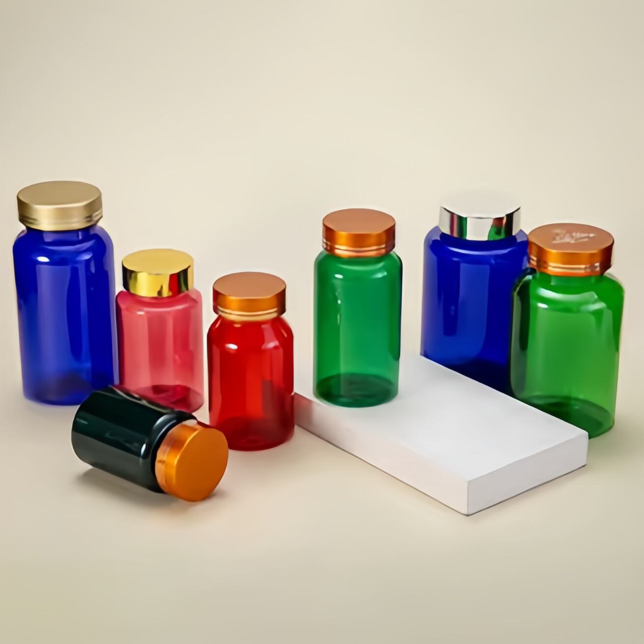
Color, typography, material, and form are not decorative afterthoughts—they’re deliberate identity carriers. Blue signals trust (a reason why financial and tech brands favor it); red conveys passion and energy; earthy greens and browns communicate sustainability without needing explanatory copy. Typography shapes perception: serif fonts suggest timelessness and authority; clean sans-serifs reflect clarity and innovation. Material choice carries ethical weight—matte recycled paper signals environmental responsibility, while rigid molded pulp implies durability and craft. Form, too, is functional storytelling: a slender glass bottle suggests premium beverage craftsmanship; a compact, stackable carton reflects efficiency and e-commerce readiness. When these elements cohere across SKUs and channels, they build a visual language so consistent that consumers recognize the brand in peripheral vision—proving that packaging for brand identity is built through disciplined, values-aligned execution—not just graphic design.
Coca-Cola’s Red Consistency: A Benchmark in Packaging for Brand Identity
Coca-Cola’s enduring red-and-white palette remains one of the most rigorously maintained visual identities in global branding. Its signature crimson—Pantone 484 C—is applied with near-sacred consistency across glass bottles, aluminum cans, PET containers, and even vending machines worldwide. The white Spencerian script and dynamic red ribbon appear unchanged across generations, markets, and formats. This unwavering continuity isn’t conservatism—it’s cognitive strategy. As demonstrated in longitudinal studies cited by the Harvard Business Review, repeated exposure to identical visual stimuli strengthens neural encoding, transforming recognition into reflex. Coca-Cola treats packaging not as disposable real estate but as permanent brand infrastructure. That discipline enables instantaneous identification—even when the logo is obscured or viewed at a distance—making it a masterclass in how consistency, not novelty, fuels long-term memorability and equity.
Authentic Storytelling Through Sustainable and Purpose-Driven Packaging
Packaging has evolved from protective shell to narrative vessel—especially for consumers who prioritize ethics alongside efficacy. Authentic sustainability isn’t signaled by vague claims like “eco-friendly” but by tangible, verifiable choices: FSC-certified paperboard, PCR (post-consumer recycled) plastic, compostable cellulose films, or minimalist mono-material constructions. When those materials are paired with clear, humble messaging—such as “100% recycled cardboard, printed with plant-based inks”—they validate brand purpose rather than obscure it. This alignment matters: a 2023 NielsenIQ report found that 78% of global consumers say they’re more likely to trust and repurchase from brands whose packaging visibly reflects their stated values. Purpose-driven design also enhances experience—unboxing a product wrapped in seeded paper that grows wildflowers, or opening a reusable tin with embossed origin storytelling, transforms transaction into ritual. In doing so, packaging becomes a tactile extension of brand integrity—one that earns advocacy, not just acceptance.
Cross-Channel Consistency: Unboxing, Social Sharing, and E-Commerce Integration
The unboxing moment is no longer an endpoint—it’s the first act of a cross-channel brand story. Thoughtfully engineered packaging—featuring cohesive color blocking, tactile finishes, or subtle structural details—naturally invites documentation and sharing. When customers post unboxings on Instagram or TikTok, they become unpaid brand ambassadors, amplifying authenticity far beyond paid media. For e-commerce brands, this means designing packages that perform equally well in thumbnail images, video close-ups, and physical handling. Consistent application of logo placement, color systems, and material textures across digital assets, social creatives, and the physical package builds familiarity at every touchpoint. Including a discreet branded hashtag or QR code linking to a values-driven microsite—like a behind-the-scenes video on sustainable sourcing—extends engagement beyond delivery. As omnichannel behavior accelerates, packaging must function as a unified brand node: recognizable in a marketplace thumbnail, resonant in-hand, and shareable in-feed. That coherence doesn’t just increase visibility—it deepens resonance, turning every unboxing into a repeatable expression of brand identity.
FAQ Section
Why is packaging considered a silent salesperson?
Packaging plays a critical role at the point of purchase by instantly conveying quality, trust, and brand identity to consumers. Visual elements like color, shape, and typography influence the subconscious decision-making process, encouraging shoppers to choose a specific product over others.
How do colors and shapes in packaging affect consumer psychology?
Colors and shapes evoke emotional responses, influence perceptions, and trigger brand recognition. For example, red signals urgency and excitement, while rounded shapes suggest approachability and friendliness.
Can sustainable packaging positively impact consumer trust?
Yes, sustainable packaging, paired with clear and honest messaging, validates ethical brand values. It appeals to eco-conscious consumers by reflecting a brand’s commitment to sustainability through tangible materials like recycled paperboard or compostable films.
How does cross-channel consistency improve brand recognition?
Maintaining consistent design elements across packaging, social media, and e-commerce channels builds familiarity and trust while enhancing visibility. It's crucial for creating a cohesive brand identity that resonates across various consumer touchpoints and platforms.

